

I started with this image cropped to the correct proportions:

The first step was to adjust the image background to be visible but faded. The first thing I did was use the Photoshop quick selection tool to select everything in the image except the Gill Man. Once that was accomplished, I added a Hue/Saturation adjustment layer. When you add an adjustment layer after making a selection, that layer only changes the area selected. With that layer, I cranked up the lightness, with the following result.

I left more detail in the image background than the real GOTG cards had, since the image was so iconic and I really wanted to have the heroine recognizable. Of course, the model card above had a more sepia tone to it. Luckily, the hue and saturation adjustment allows the image to be colorized. So, I clicked the colorize box, then adjusted the hue into the yellow range. At this point, I also softened the edges of the selection and added an embossing effect to bring in the shadow around The Gill Man. That took a lot of trial and error and I didn't do it in a way to save the intermediate step. So, all of the changes in this paragraph led to this result:

The next step was to add the border. This was fairly simple. I opened a real GOTG card image, scaled it up to the same size as my base image, then selected the border and hit Control-C to copy the selection. I went back to the Gill Man image, pasted it on.

This is where one of the weaknesses of my effort is noticeable. The border was at a different level of detail resolution which is blatantly obvious when you zoom in.

Next, I added the Fleer logo, and embellishment at the bottom, by using the lasso tool to select it on a real GOTG card then drop it into a new layer on my image.

Then I added a layer mask and used the pencil tool to mask out all the white space around the logo so the underlying image shows through:

I wasn't real happy how the logo looked at this point. So I cranked up the intensity of the red channel on the crown and lowered the brightness on the script to make it pop better:

The last part to complete the card front was to add text, which is a fairly simple thing to do. I had to make one change here. On the real cards, the text is in silver foil. But, that would not show up well in a digital image, so I decided to put the text in black. Also,the layout of the card led to a problem. Where the text went on top of the Gill Man, it disappeared:

To resolve this, I determined the "base" color of the card, since it wasn't pure white and dropped a solid layer of that color down over the top of the card. I then added a layer mask and basically brought the complete underlying image back in except for a one pixel border around the text where it crosses over the Gill Man's legs, so it can be more visible.
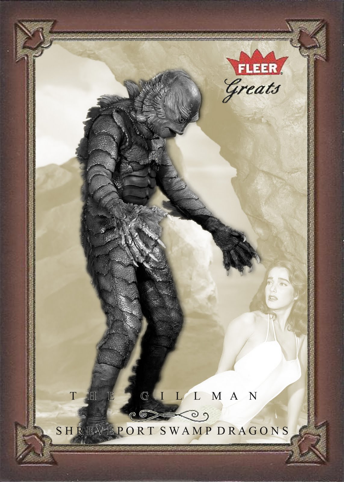
And that was it. The front of the card.
No comments:
Post a Comment